Building Integration Between Home Management & E-Commerce
MY ROLE
UX Designer
COMPANY / CLIENT
Microsoft / Secom Group
PROJECT DURATION
May 2023 - July 2023
TOOLS
Figma / Microsoft Teams
PROCESS/SKILLS USED
Visual Design
User Research
Competitive Analysis
Journey Mapping
UI Analysis
Lo-Fi/Hi-Fi Prototyping
OVERVIEW
During my time at Microsoft, I developed high-fidelity designs for Secom Group, a Microsoft partner specializing in security products. I was tasked with analyzing two of their products, a home management app and an e-commerce site, to find ways to create a shared customer base for the two platforms. I proposed and designed brand-new features, including new electronic lock/camera tools, streamlined purchase design workflows, and less intrusive ad formats.
BACKGROUND
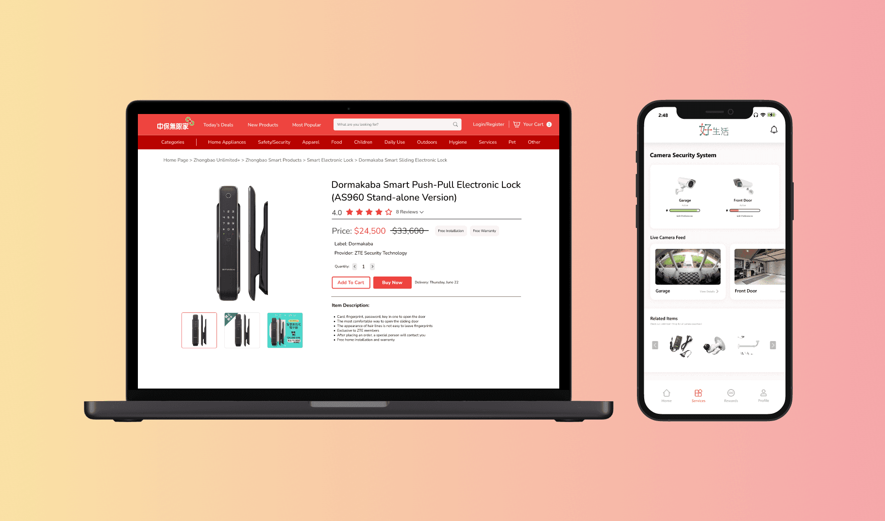
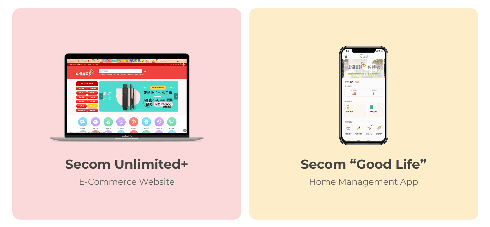
Taiwan Secom Group, a leading security services provider in Taiwan, offers products like security systems, surveillance, and smart home solutions. While mainly focusing on hardware products, Secom also provides several software products. One of these platforms is the "Unlimited+" e-commerce website, where users can buy a variety of products such as frozen goods, first-aid supplies, and the company's reputed smart security devices. Furthermore, Secom also maintain a home/community management app called "Good Life", an all-in-one app that assists with residential-related tasks such as package tracking, community facility announcements and security device features.
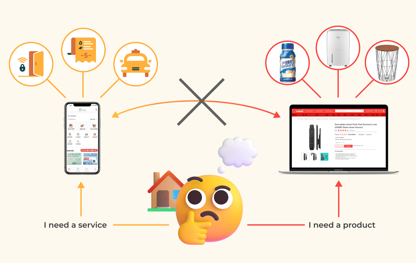
NO STRONG LINK BETWEEN PLATFORMS
Despite attempting to use these two platforms in an effort to expand into smart home/life services, there is no unity between the vision for the two products, which are intended for same customer base.
This lack of integration and clear disconnect fragments the user experience, preventing seamless transitions between property management and e-commerce services as users address their smart home needs, leading to user frustration and reduced engagement.
PROJECT GOAL
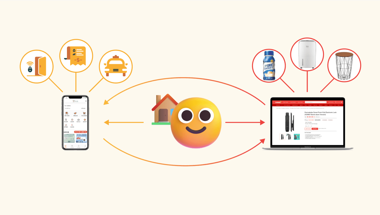
To fully realize the potential of their offerings, I was tasked to addressing this gap and create a more integrated, user-friendly ecosystem that aligns with their brand's overarching purpose.
BRAINSTORMING
I started this project by assessing the current offerings of the e-commerce and home management platforms individually, followed by identifying the overlapping features and products between two platforms. After completing this, I also came up with different additional features and service offers that could be used to enhance the integration of the two ecosystems.

FINDING NEW BRIDGES BETWEEN TWO PLATFORMS
After thoroughly exploring both platforms, I created flow diagrams that clearly defined their functions, which also clearly highlighted the minimal integrated features. In fact, there was only one connection between the platforms, which was product ads directing users from the home management app to the e-commerce site.
Next, I created an improved user flow diagram that included the new features that was previously brainstormed. A significant improvement in the integration between the two apps can be seen when the old and new user flow is placed side by side, enabling smoother transitions for users and increased functionality for improving a user's smart home experience.
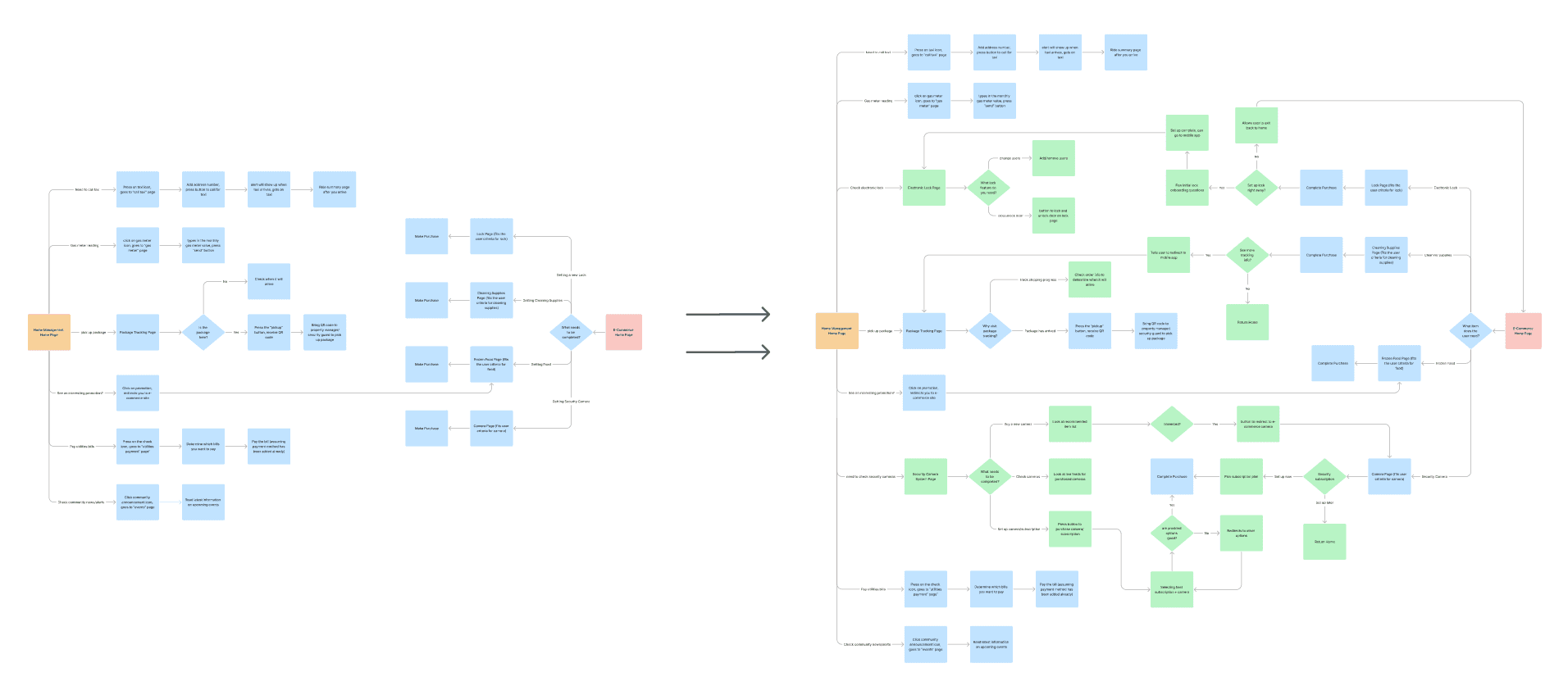
User Flow Before Changes vs. User Flow After Changes (Green symbolizes newly added decisions/actions)
TWO LEVELS OF PLATFORM INTEGRATION
Through the process of analyzing both platforms and brainstorming new features, I discovered and defined integration into two different types:
Basic Interactions: primarily focus on navigation and redirection between the home management platform and the e-commerce site, allowing users to move between the two platforms.
Integrated Interaction: offer a more cohesive experience by combining the functionalities of both platforms, creating a more integrated and efficient user journey for customers.
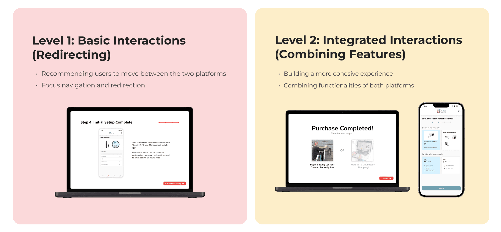
While basic interactions facilitate simple navigation between the platforms, they fall short in fostering true customer loyalty or creating a smooth user experience when transitioning between the two platforms. To truly engage users and encourage long-term retention, using integrated interactions is what unifies the functionalities of both platforms and provides a more efficient, cohesive multi-platform ecosystem for the customer.
MAJOR REDESIGNS
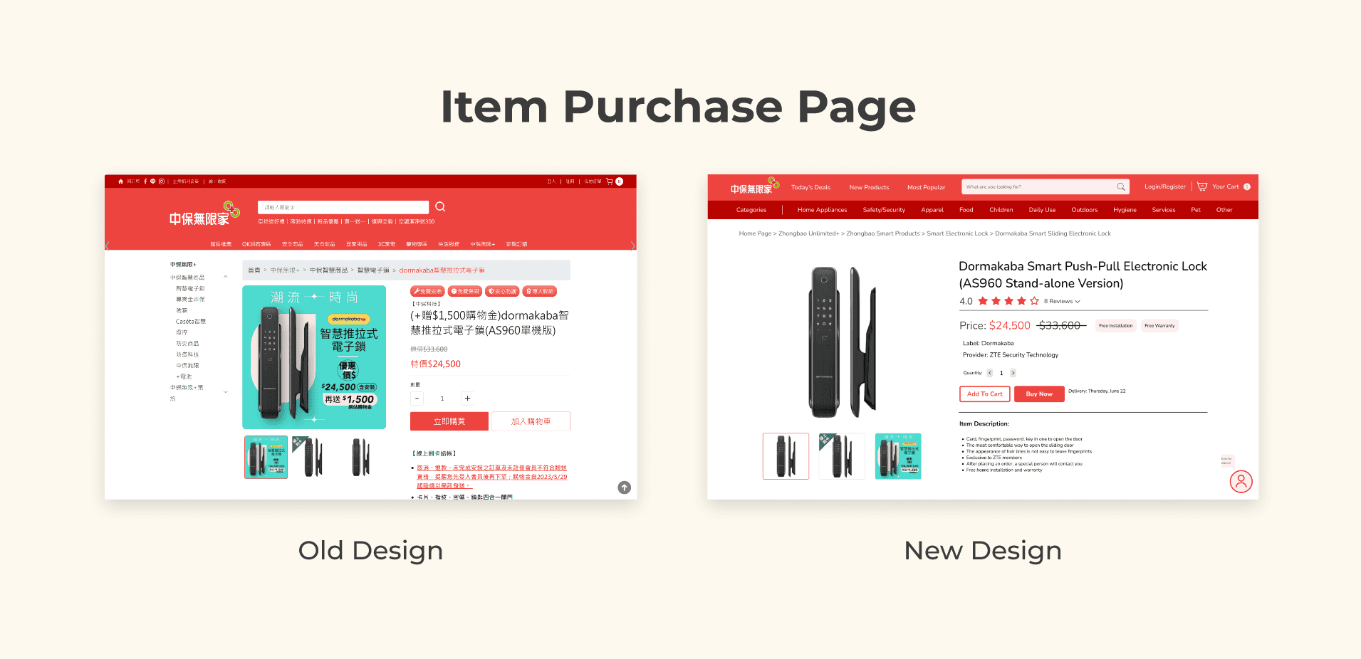
The first major design change involves a comprehensive redesign of both platforms, particularly the e-commerce site, which is has a very cluttered interface, making it hard to hard to navigate and challenging for new users to find what they need.
BRAND-NEW SECURITY FEATURES
To design the best website and app, I decided both platforms should play into the company's main strengths - providing customers with great security products and services. This means prioritizing and building features that involve combined security solutions, such as the ordering, set-up process, and maintenance of smart home electronic locks and security cameras.
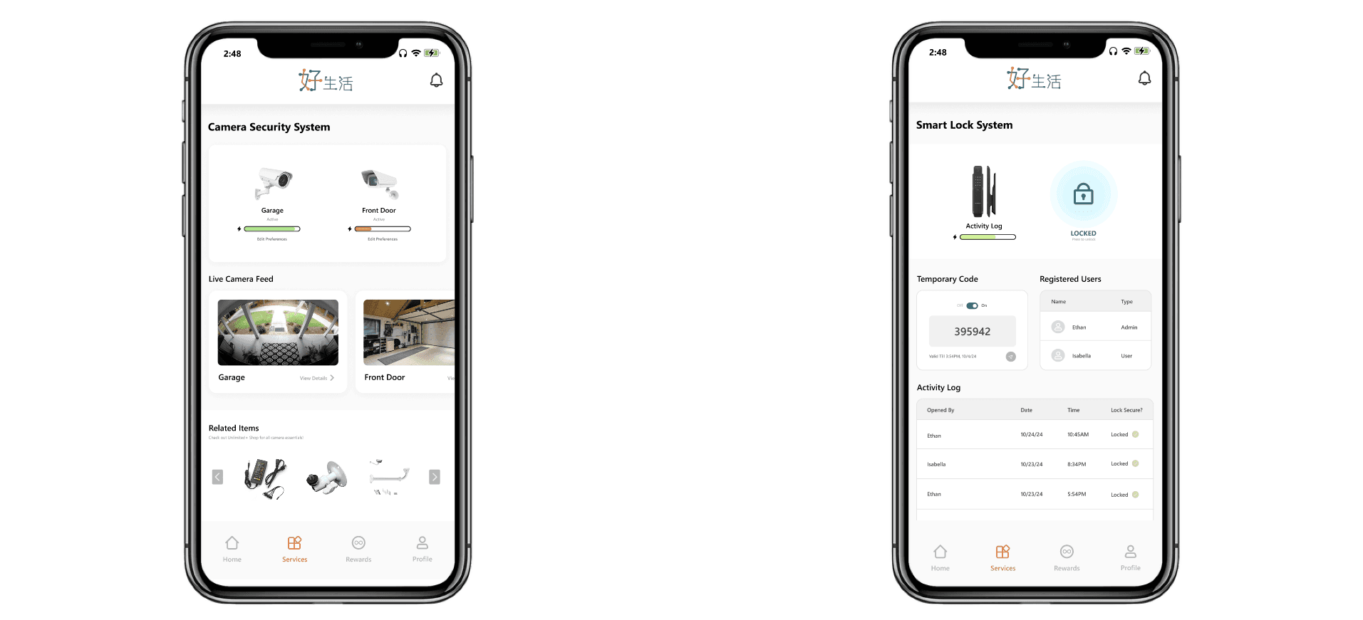
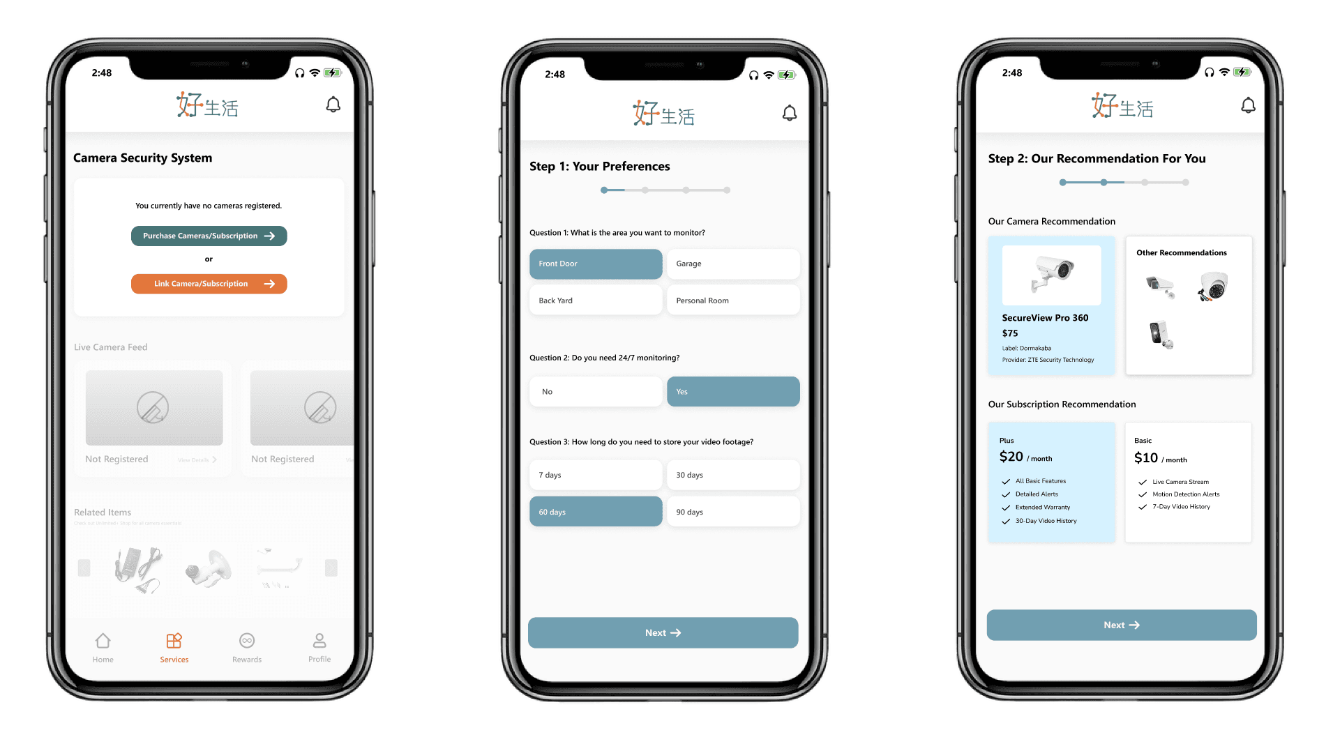
Security Camera Monitoring Page: Secom security camera/monitoring systems available for purchase on the e-commerce website can be monitored and controlled through the home management app, including features such as checking camera status, current battery life, and live video feeds.
Electronic Lock Page: the company currently offers a variety of different lock types, each with its own unique software. Centralizing all lock-related features within the home management platform is an effective first step toward creating a unified ecosystem between the two platforms.
EXPANDING ON BASIC (LEVEL 1) INTERACTIONS
Although basic interactions don't completely transform the user experience of integrating app functionalities, they do offer opportunities to enhance the transition for users across both platforms. Below are some of the ways I expanded and improved these interactions.
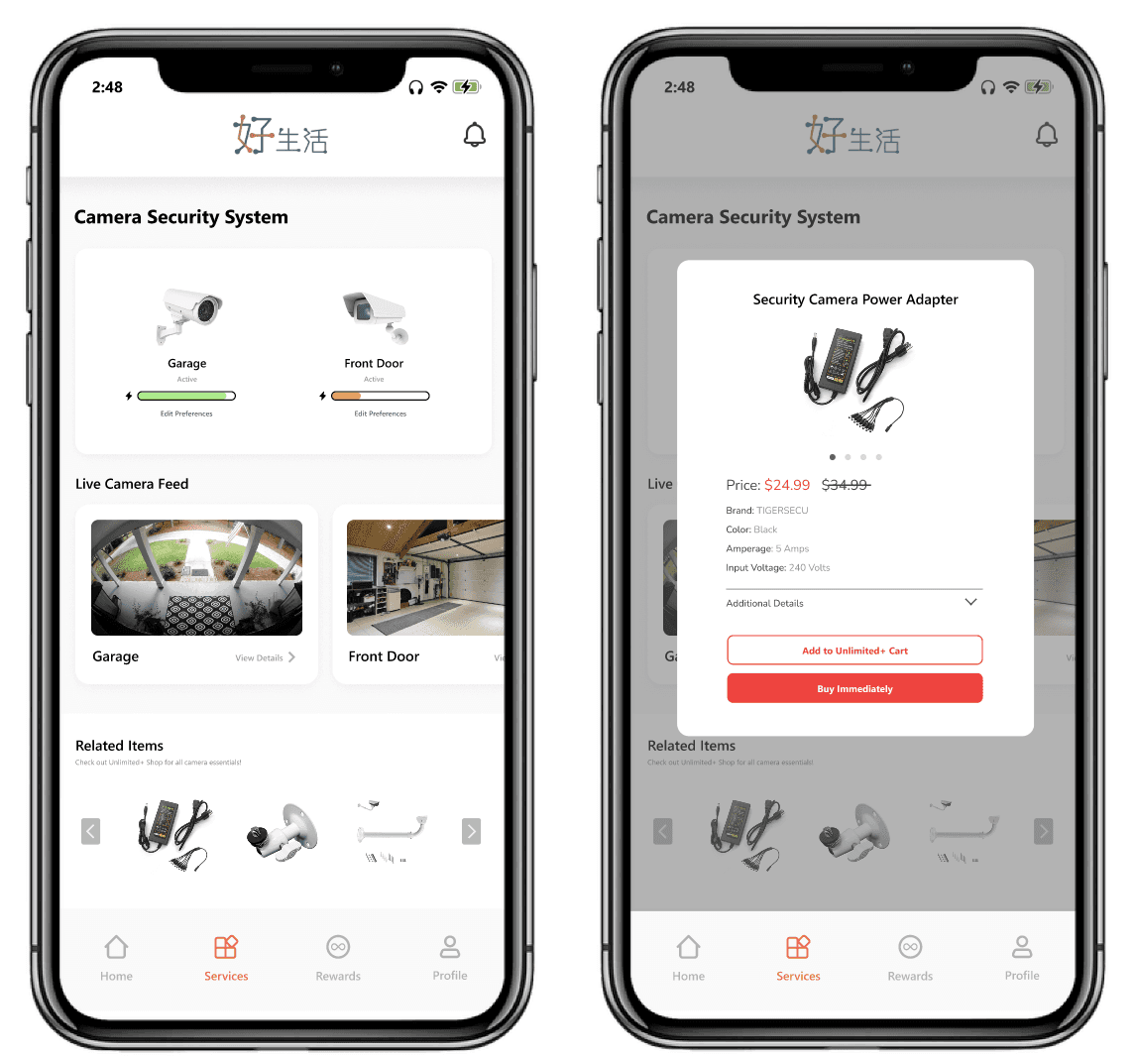
Replacing Intrusive Ads with Helpful ones: Currently, e-commerce ads appear randomly throughout the home management app, making them intrusive and disconnected. The new designs display recommended products only in relevant contexts.
The home management app's camera security system screen exemplifies the shift from intrusive to helpful ads. Placing spare parts as purchase suggestions on this screen increases the likelihood of purchase by targeting users most likely to need them.
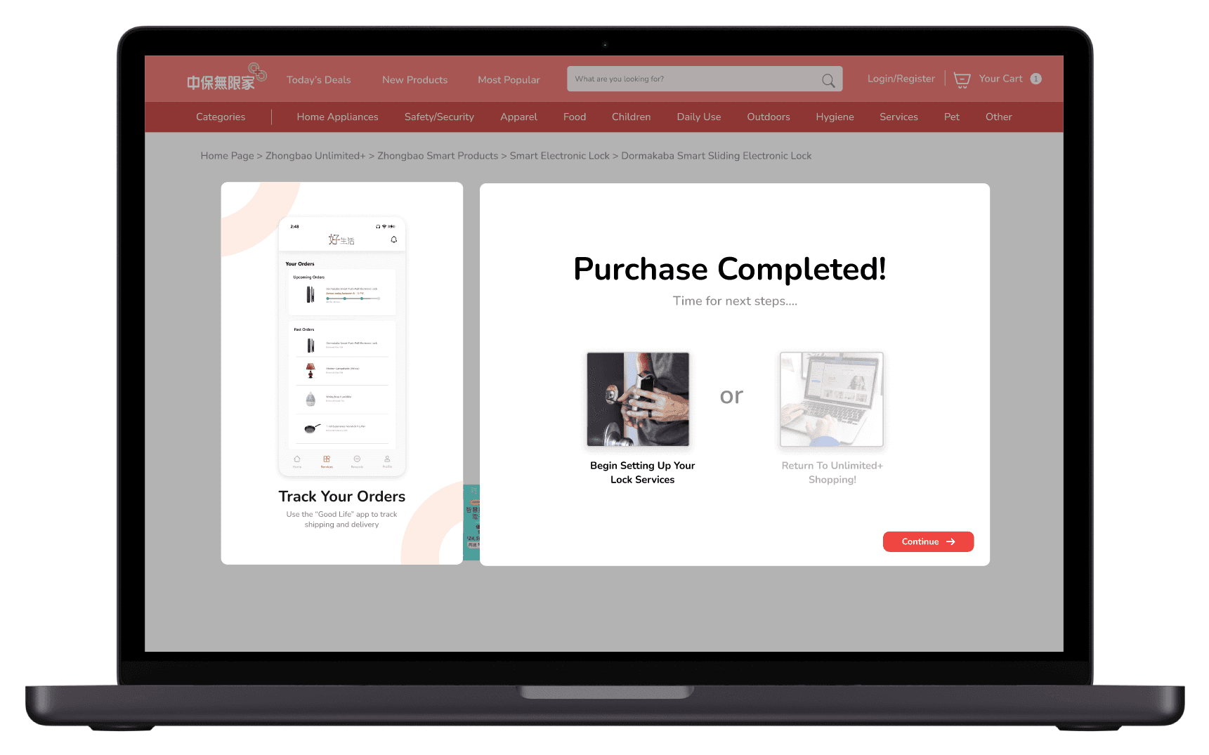
Reminders of Feature Integration: Reminding users of the connection between platforms helps them see the synergy and value they provide. Some users may not realize the platforms are integrated, so introducing notifications during their journey enhances this awareness.
For example, on the “Purchase Completed” Page of the e-commerce site, suggest using the home management app’s shipment tracking feature, allowing customers to track deliveries directly from their mobile device.
CREATING BRAND-NEW INTEGRATED (LEVEL 2) INTERACTIONS
Immediate Set-Up After Product Purchase: Purchasing a smart product from the e-commerce website allows customers to start configuring their preferences and settings immediately, even before the device arrives. This initial setup on the desktop website simplifies the eventual transition to the home management app, as users will have fewer tasks to complete during the device setup on the home management app, making the onboarding process smoother and more intuitive.


Smooth Device/Service Purchase Integration: When users visit a smart device page on the home management platform for devices they don’t own, the app provides two options: they can be redirected to the e-commerce website to browse models or complete a product questionnaire to find the best fit. This integration enables seamless e-commerce purchases and subscription plans directly within the app.
KEY TAKEAWAYS
Balancing Functionality with Simplicity: Integrating two apps taught me the importance of balancing functionality with usability. I found that simplifying the user journey often provides a better experience than adding numerous features that may eventually overwhelm users.
Bridging Users Across Different Platforms: At first, the two platforms appeared to serve users with different needs. However, identifying and addressing the requirements of the overlooked user group was a rewarding challenge that improved my user-centered design skills.
Navigating Challenges of Cross-Platform Design/Branding: It was very fun exploring and navigating the complexities of designing with two distinct platforms in mind. I had to consider multiple factors such as consistent UI/UX and smooth navigation within and between the two platforms.
CHECK OUT MY OTHER WORK
